How to Read a Stock Chart: A Beginner’s Guide
Understanding the Basics of Stock Charts
A stock chart serves as a crucial analytical tool that graphically represents a stock’s performance over a designated time period. For investors and traders, stock charts are invaluable for delving into trends, forecasting future behavior, and making sound investment choices. These charts encapsulate a stock’s price history, allowing for insightful examination of how prices fluctuate over time.
Types of Stock Charts
Investors and traders utilize various types of stock charts, each offering unique insights into market behavior:
Line Charts: Primarily focused on illustrating the closing prices of a stock over time, line charts provide a straightforward depiction of price trends. They are exceedingly useful for those seeking a simplistic and clean representation of a stock’s trajectory, particularly when the goal is to discern general patterns in price movement without being distracted by intra-period details.
Bar Charts: More informative than their line chart counterparts, bar charts furnish a detailed breakdown by showcasing the opening, closing, high, and low prices within a given timeframe. Each component—whether it be the top, bottom, or sides of the bar—delivers critical information about price fluctuations, enabling investors to gain a comprehensive perspective on daily or weekly trading dynamics.
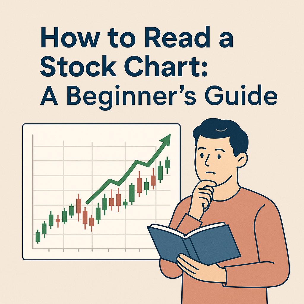
Candlestick Charts: Similar in data provision to bar charts, candlestick charts elevate readability through the use of ‘candles’—visual elements that succinctly capture the opening, closing, high, and low prices. The color and shape of each candle convey trading patterns over specific intervals, making them particularly favored by those seeking daily insights into market behavior.
Key Components of a Stock Chart
A thorough grasp of stock charts necessitates an understanding of their fundamental components:
Price Axis: Situated vertically along the chart, the price axis delineates the range of security prices over the relevant period, allowing investors to gauge how current prices stack up against historical ranges.
Time Axis: Placed horizontally at the base, the time axis marks out the intervals in which stock prices are recorded, be it over days, weeks, or months, aiding investors in contextualizing price movements within specific temporal frameworks.
Volume Bars: Positioned below the main price chart, volume bars graphically communicate the quantity of shares traded within a set period. High trading volumes can signify strong interest or participation in a stock, often enhancing the understanding of broader market trends.
Trend Lines: Trend lines are strategic lines drawn to connect several price points, providing visual insight into the general direction of price movement. They are instrumental in identifying whether a stock is following an upward, downward, or sideways trajectory.
Analyzing Stock Chart Patterns
Chart patterns emerge from the natural oscillations of stock prices and are vital for predicting future market movements:
Triangles: Recognized for their indication of a phase of consolidation leading to a breakout, triangle patterns can manifest as ascending, descending, or symmetrical. They serve as harbingers of potential price direction changes following a period of relative equilibrium.
Head and Shoulders: This classic pattern signals potential reversals in market trends. Consisting of three peaks—the central peak (head) being higher than the two surrounding ones (shoulders)—it often indicates an impending shift in trend direction.
Double Tops and Bottoms: Characterized by their repetitive price movements, these patterns suggest reversal points. A double top indicates a probable downturn after two peaks at similar price levels, while a double bottom suggests an upward movement following two low points.
Moving Averages
Stock charts often incorporate moving averages to reduce short-term volatility and underline longer-term trends:
Simple Moving Average (SMA): Calculated as the unweighted average of previous stock prices over a defined number of periods, SMA provides a straightforward method to assess an average price trend over time.
Exponential Moving Average (EMA): The EMA enhances the weighting of recent prices, enabling quicker responses to current price changes compared to the SMA, making it a preferred choice for those needing more prompt trend analysis.
Indicators and Oscillators
For more granular insights, traders often rely on a suite of indicators and oscillators:
Relative Strength Index (RSI): This momentum oscillator evaluates the speed and magnitude of recent price changes to identify overbought or oversold conditions. An RSI reading above 70 may signify overbought conditions, while a score below 30 can indicate oversold conditions.
Moving Average Convergence Divergence (MACD): MACD reflects the relationship between two moving averages (typically, the EMA) of a stock’s price, presenting a visual and numerical indicator to determine trend momentum and potential reversals.
For those seeking a more comprehensive exploration of various stock chart types and their applications, a thorough reference such as the Investopedia resource may prove beneficial.
Conclusion
Mastering the interpretation of stock charts is a fundamental skill for anyone pursuing success in the investment arena. By meticulously analyzing the various chart components and recognizing key patterns, investors are better equipped to make strategic decisions that align with market dynamics. Although honing this skill set requires time and practice, the foundational concepts outlined in this guide offer a valuable starting point for beginners. As proficiency develops, investors can explore more intricate charting methods and tailored analytical strategies to refine their market acumen further.
This article was last updated on: January 11, 2026